
A mobile application for bus riders to plan their trips around the city and to track their specific bus. From this centralized app, users have access to information on arrival and departure times of all bus lines.

OVERVIEW
Project Summary
The Problem:
Due to expansion, numerous bus routes have been added, many buses stop at the same bus stop. This has caused confusion and frustration for the riders.
The Solution:
urBus, allows riders to:
-
Access arrival & departure times of all bus lines
-
Identify which bus is arriving at a specific stop
-
Calculate travel time to the bus stop
-
Allow riders to select one of the multiple bus lines arriving at the stops on their routes


PROCESS
Discovery & Research
The Goals:
-
To understand the end-to-end journey of how and why riders choose to use the bus system
-
To learn about any pain points riders are encountering during their journey
-
To uncover riders’ thought processes and prior experiences behind tracking their specific bus
-
To discover the different tools that the city can use to share the accurate bus arrival times with the riders
The Methods:
To understand riders desires, preferences, usage experiences, and pain points, I conducted:
-
User Surveys
-
User Interviews
-
Competitive Analysis
User Survey:
Collected data for the target audience through a Google survey sent to participants who Identified themselves as students, professionals, and city dwellers.
Insights from the survey:
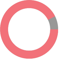
92.6%
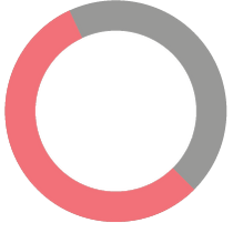
55.6%
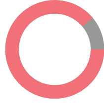
88.9%
Use public bus as transportation
Use a mobile app to
plan their trip
Identify their bus by
bus number
Most important features of a travel app:
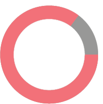
85.2%
Quick & easy access
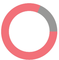
81.5%
Estimated time of arrival
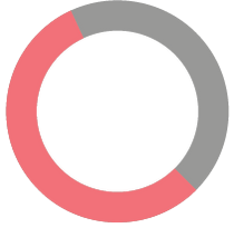
55.6%
Step-by-step navigator
*Percentage based on 30 respondents
User Interviews:
To further research, I conducted five in-person and remote interviews
Key takeaways:
Important features:
-
Knowing bus arrival time
-
Direction bus is headed
-
Number of stops until the final destination
Frustrated by:
-
Inaccurate ETA
-
Hard to navigate interface
-
Hard to use the trip planner
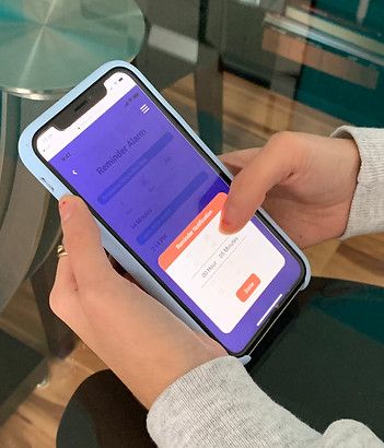
Competitive Analysis:


Key Findings:
Conducted a SWOT analysis combining data from two of the most popular public transportation apps that all offer similar things. The biggest takeaway from this, in terms of design, was that an intuitive and clear flow was important. Too many features can be confusing for the average user. Also, too much information may disrupt the user flows.
Strengths
• Updated bus time
• Live navigation guide
• Quick & easy access
• Real-time arrival
• Set-up alarms
• Maps view
• Clear/bold interface
• Color scheme
Weaknesses
• Slow to navigate the app
• Inaccurate bus schedule
• Unreliable ETA
• Inconsistent schedule
• Weak GPS signal
• Poorly optimized features
Opportunities
• Location tracker
• Better UI design
• More reliable system
• Voice shortcut-ask Siri
• Notifications
Threats
• Live navigation guide
• Real-time arrival
• Service alerts
• Users reports
• Limited network
User Personas:
After getting an understanding of competitors in the space, I needed to conduct a few interviews with some of the respondents from the user survey to really get an idea of who our target audience is and what they are looking for. After conducting these interviews, I came up with two user personas: The Student and The Commuter.

Darya
Age: 20
Occupation: College Student
Status: Single
Location: Chicago
The Student
“How long will I be waiting?”
Motivations:
On weekdays she uses the bus to get to her college. She uses one of the bus lines at Washington and State street to get to the campus since her apartment is right around the corner. Sometimes she meets her boyfriend after her classes for dinner and that’s when she takes a different bus depending on where they are going to meet. Sometimes she meets him at the bus stop and then walks to the restaurant. She also takes the bus to visit family and friends.
Goals:
-
Get to her classes on time
-
Accurately plan her mornings and evenings commute
-
Make sure she doesn’t miss her bus
-
Accurately plan her social events
-
Make sure she doesn’t miss her dinner dates with her friends
Frustrations:
-
Which is the next arriving bus?
-
How much time does she have to get to her bus stop?
-
Whether or not her commute will be disrupted
-
To track her bus so she can plan her work commute and social events
-
Which bus is the one she needs to take at Washington and State bus stop

Niki
Age: 55
Occupation: Hairdresser
Status: Married
Location: Chicago
The Commuter
“Will I get to work on time?”
Motivations:
Niki uses the bus to commute to and from work. She uses one of the bus lines at Washington and State street to get to the salon she works at on weekdays and a different bus line on the weekends to get to the other salon since their apartment is right around the corner. Sometimes she meets her boys after work for dinner and that’s when she takes a different bus depending on where they are going to meet.
Goals:
-
Get to work on time
-
Accurately plan her mornings and evenings commute on the weekdays and weekends
-
Make sure she doesn’t miss her bus
-
Accurately plan her after-work social events
-
Make sure she doesn’t miss her yoga lessons at the yoga studio 3 times a week
Frustrations:
-
Which is the next arriving bus?
-
How much time does she have to get to her bus stop?
-
Whether or not her commute will be disrupted
-
To track her bus so she can plan her work commute and social events
-
Which bus is the one she needs to take at Washington and State bus stop on weekdays/weekends
Empathy Map:
Does
-
Hear different route options
-
Wait for the bus
-
Keep track of schedule before leaving home
-
Check the real-time information in the app
Feels
-
Confused by all these additional buses
-
Frustrated by delays due to an accident
Thinks
-
When will the next bus arrive?
-
How much time do I have to get to the bus stop?
-
Will I reach my destination on time?
-
Is there going to be a delay?
Says
-
Am I going to get to work on time?
-
It’s hard to read the schedule
-
I can’t see the bus number

Pain
-
Unreliable estimated time of arrival
-
Poorly optimized features
Gain
-
Saving money and time
-
Quick & Easy way to plan your trip
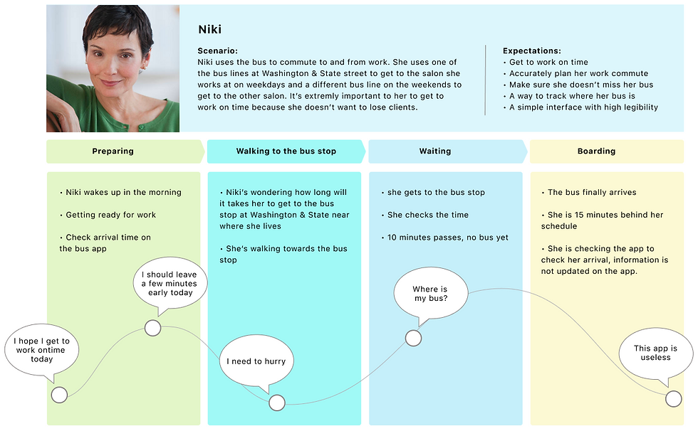
Journey Map:
Created a detailed user journey to further visualize the project concept and get ready for wireframing.
PROCESS
Information Technology
User Stories:
User stories help to prioritize the main features of the product and they can provide a blueprint to create user flows. Created a spreadsheet with possible tasks that users could complete within the app and labeling them in terms of importance. This would help guide the design process and keep focused on the most important tasks. The high priority tasks were used to make the MVP.
1
“I need to know when to leave my house to get to the bus stop on time to catch my bus.”
2
“I want to know the suggested routes so I can decide which will work for my schedule on a specific day.”
3
“I want to be able to track my bus on a live map. I also want to receive real-time alerts.”
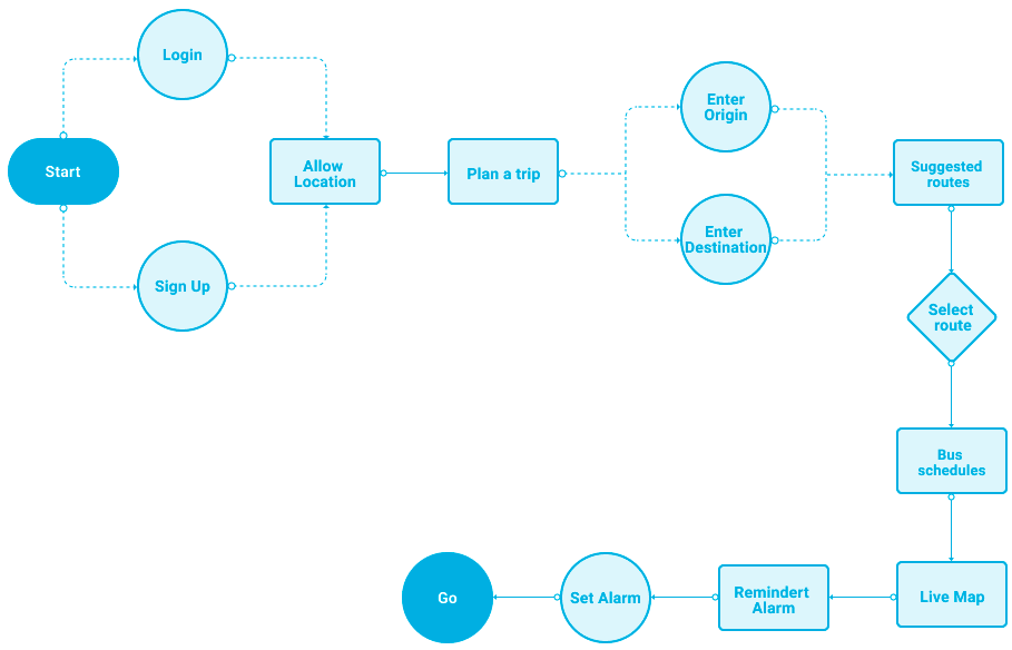
User Flow:
After finishing user research, it was time to begin thinking about the important features in the app. Based on the answers I received from the survey and user interviews/personas, I created a user flow to better visualize the user's experience through the app.

Sketches:
Based on all previous research, I created a series of hand sketches to begin visualizing the interface of the app and how a user might interact with it.

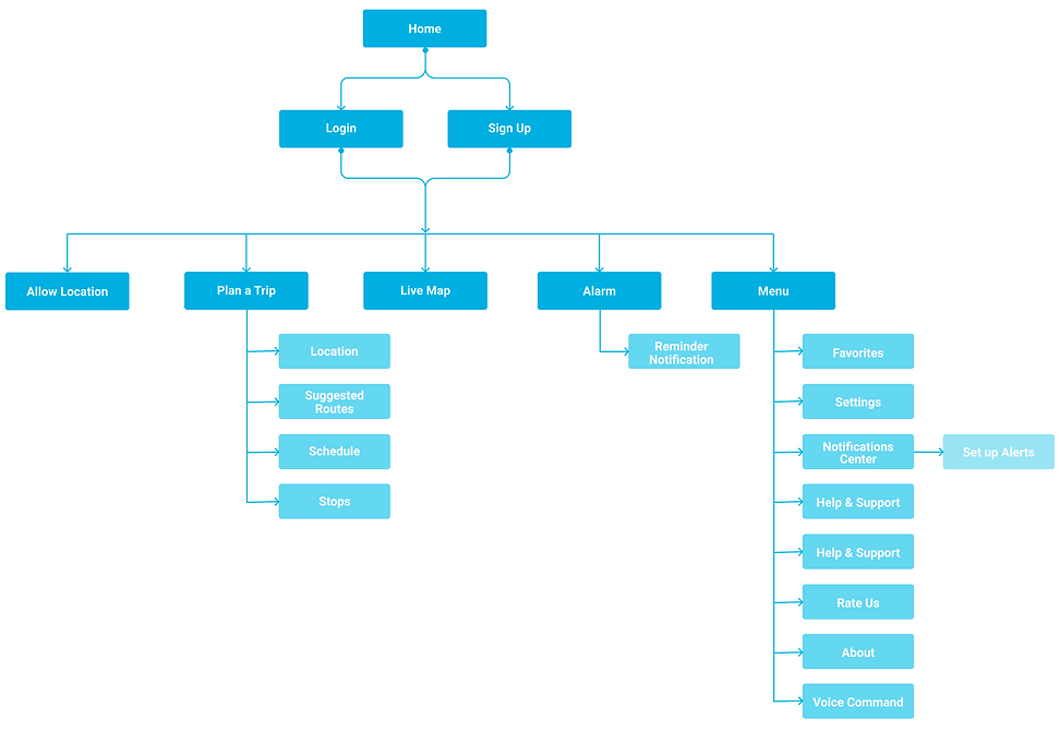
Site Map:
The structure of the app that was most logical and simplified was defined so that the users would better adjust to the functionality of the product.
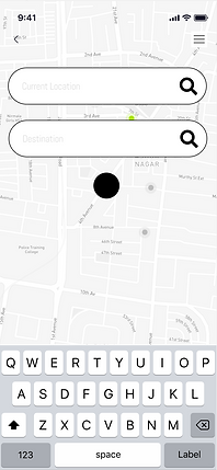
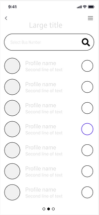
Wireframes:
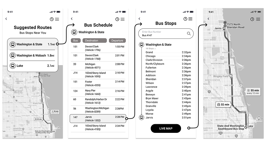
In this stage, rough sketches were developed into a more defined digital version in grayscale. They provided better clarity on the components and content of the app.


BRANDING
Visual Design
Brand Development:
To start with the final design; the UI style guide was finalized by picking colors and styles that represented urBus. Since riders will use the app on a daily basis, I wanted the platform to feel and look simple and inviting so I picked warm and bright colors.
Logo Development:
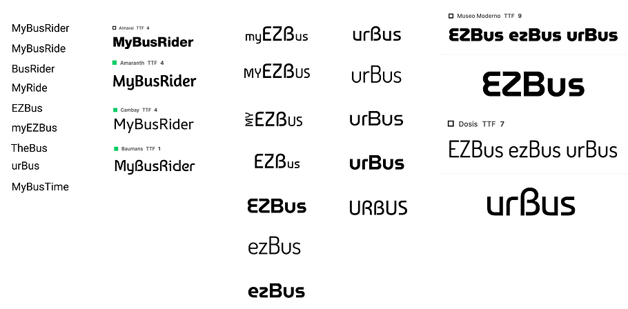
Since urBus is a transportation app that will be used by thousands of riders, I decided to go with a simple logotype treatment to design the logo.
Final Logo Applications:


UI Style Guide:
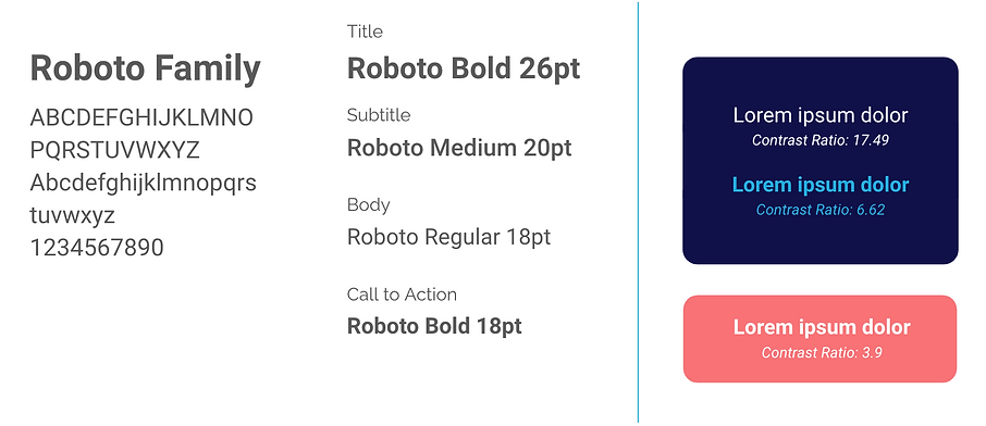
To start with the final design, the UI Style Guide was developed by selecting fonts and colors.
Typography:
Color Contrast Checker:
Colors:
I utilized the Adobe Color accessibility tools to make sure our color choices are accessible and blind safe.
#FA7276
#111149
#05ACDD
#979797
#FFFFFF
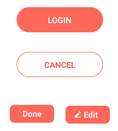
Icons & Bottons:
PROTOTYPE
& User Testing
Outcome:
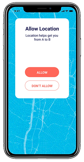
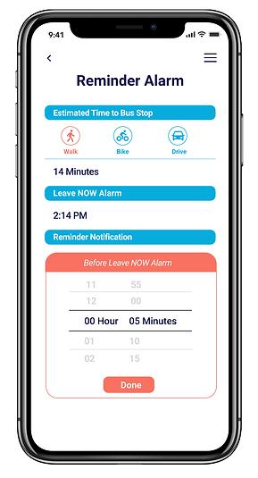
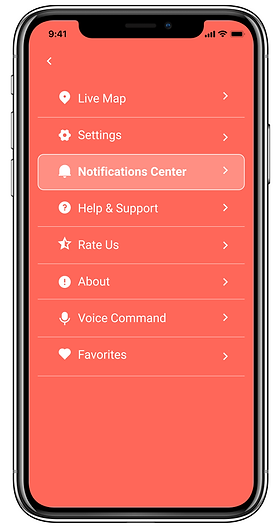
After the app’s branding and identity were finished and applied to prior designs, I created a series of high-fidelity mockups that were based on the original low-fi wireframes.



User Testing:
After a high fidelity prototype was completed, I did a usability test to determine how a user navigates through the app to plan a trip and to set up an alarm.
Usability Test Results:
Mission 1: Plan a trip
7.8s
The average time spent on screens in this mission
Mission 2: Set up an alarm
9.2s
The average time spent on screens in this mission
11.2%
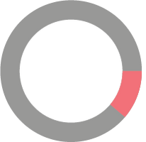
Mission’s average misclick rate
22.3%

Mission’s average misclick rate
Design Iterations:
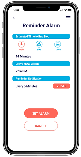
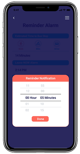
After gathering insight from user testing, I iterated our designs to reflect the needs and behaviors of the users. Key design changes are illustrated below.
Before
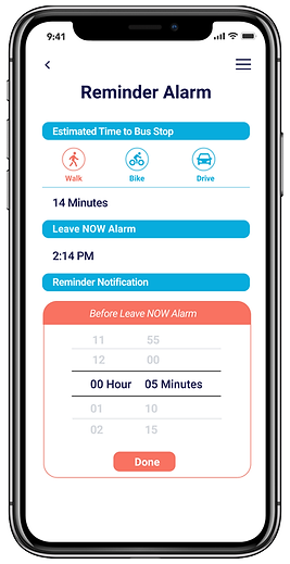
After

CONCLUSION
Outcome & Result
Outcomes:
-
After extensive research, prototyping, and testing I understand the users’ needs, goals, and motivations
-
Achieved a working MVP to help bus riders manage bus times
Lessons:
-
User testing is vital at every step of the design process because they test my assumptions
-
There remain areas that could use further testing such as visual design and accessibility
-
Consistency in language and design elements across the app is important in building trust with the user
Next Steps:
Conduct further research and track user’s behavior with analytics to determine the success of urBus app.
Conclusion:
This project provided a learning experience in gathering user feedback through multiple channels to guide the design process of a user-centered product.